결과물🤟🏻:
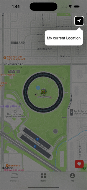
이용자들에게 어플리케이션을 사용하기 전, 기본 UI의 기능을 소개하는 튜토리얼 애니메이션
이번 애니메이션을 학습하게된 계기 🔫:
UI/UX의 디자인 및 애니메이션은 시각적인 화려함과 재미에 대해 중요도를 높이 평가할 수 있다. 또한, 이용자들에게 별도의 사용설명서 혹은 지침을 제공하지 않더라도 디자인 혹은 애니메이션을 통해 어플리케이션의 기능을 자연스럽게 이용 및 기능을 사용할 수 있도록 유도하는 것이 매우 중요하다.
Reference ✂️ :
과정 🎩:
한개의 모델과 2개의 View로 구성하였으며 사용된 코드 중 학습한 코드에 대해 공부하고자 한다.
기본 View를 구성하는 것은 Mapkit과 TabView를 활용하여 구성하였다.
이번 클론코딩 학습을 통해 Highlight View에서 새로운 점들을 배울 수 있었기 때문에 Highlight View의 코드를 뜯어 보고자 한다.
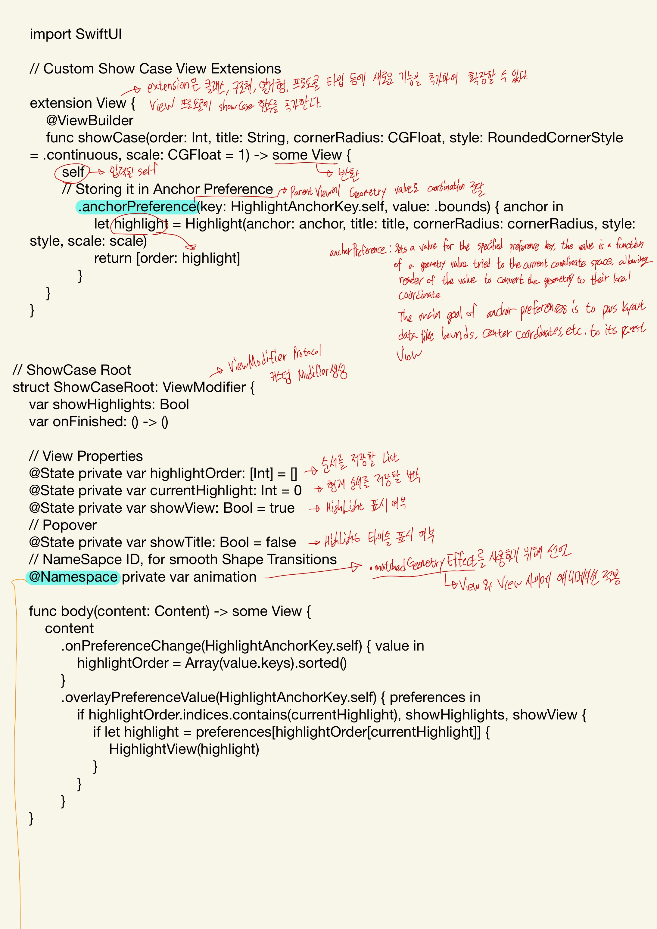
import SwiftUI
// Custom Show Case View Extensions
extension View {
@ViewBuilder
func showCase(order: Int, title: String, cornerRadius: CGFloat, style: RoundedCornerStyle = .continuous, scale: CGFloat = 1) -> some View {
self
// Storing it in Anchor Preference
.anchorPreference(key: HighlightAnchorKey.self, value: .bounds) { anchor in
let highlight = Highlight(anchor: anchor, title: title, cornerRadius: cornerRadius, style: style, scale: scale)
return [order: highlight]
}
}
}
// ShowCase Root
struct ShowCaseRoot: ViewModifier {
var showHighlights: Bool
var onFinished: () -> ()
// View Properties
@State private var highlightOrder: [Int] = []
@State private var currentHighlight: Int = 0
@State private var showView: Bool = true
// Popover
@State private var showTitle: Bool = false
// NameSapce ID, for smooth Shape Transitions
@Namespace private var animation
func body(content: Content) -> some View {
content
.onPreferenceChange(HighlightAnchorKey.self) { value in
highlightOrder = Array(value.keys).sorted()
}
.overlayPreferenceValue(HighlightAnchorKey.self) { preferences in
if highlightOrder.indices.contains(currentHighlight), showHighlights, showView {
if let highlight = preferences[highlightOrder[currentHighlight]] {
HighlightView(highlight)
}
}
}
}
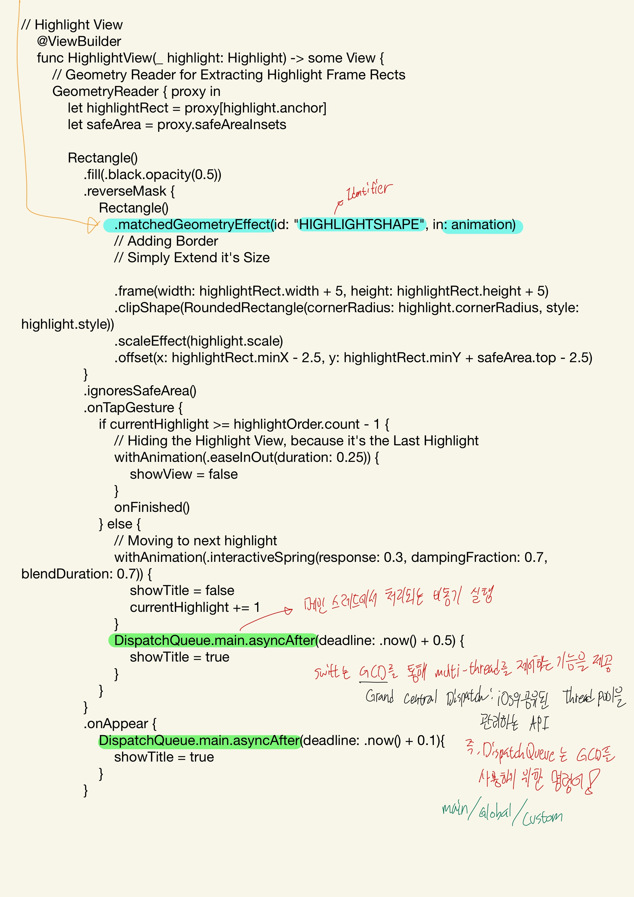
// Highlight View
@ViewBuilder
func HighlightView(_ highlight: Highlight) -> some View {
// Geometry Reader for Extracting Highlight Frame Rects
GeometryReader { proxy in
let highlightRect = proxy[highlight.anchor]
let safeArea = proxy.safeAreaInsets
Rectangle()
.fill(.black.opacity(0.5))
.reverseMask {
Rectangle()
.matchedGeometryEffect(id: "HIGHLIGHTSHAPE", in: animation)
// Adding Border
// Simply Extend it's Size
.frame(width: highlightRect.width + 5, height: highlightRect.height + 5)
.clipShape(RoundedRectangle(cornerRadius: highlight.cornerRadius, style: highlight.style))
.scaleEffect(highlight.scale)
.offset(x: highlightRect.minX - 2.5, y: highlightRect.minY + safeArea.top - 2.5)
}
.ignoresSafeArea()
.onTapGesture {
if currentHighlight >= highlightOrder.count - 1 {
// Hiding the Highlight View, because it's the Last Highlight
withAnimation(.easeInOut(duration: 0.25)) {
showView = false
}
onFinished()
} else {
// Moving to next highlight
withAnimation(.interactiveSpring(response: 0.3, dampingFraction: 0.7, blendDuration: 0.7)) {
showTitle = false
currentHighlight += 1
}
DispatchQueue.main.asyncAfter(deadline: .now() + 0.5) {
showTitle = true
}
}
}
.onAppear {
DispatchQueue.main.asyncAfter(deadline: .now() + 0.1){
showTitle = true
}
}
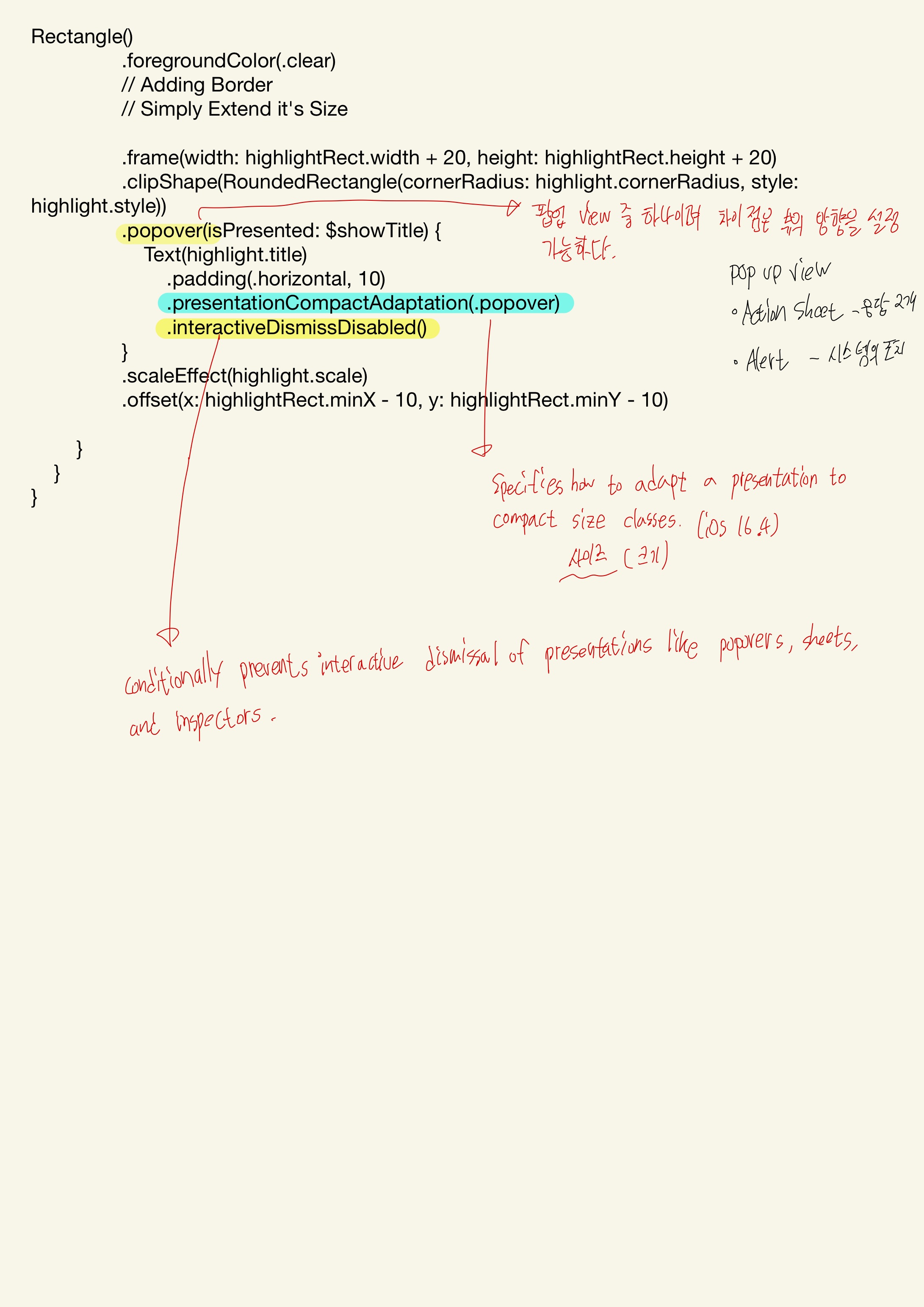
Rectangle()
.foregroundColor(.clear)
// Adding Border
// Simply Extend it's Size
.frame(width: highlightRect.width + 20, height: highlightRect.height + 20)
.clipShape(RoundedRectangle(cornerRadius: highlight.cornerRadius, style: highlight.style))
.popover(isPresented: $showTitle) {
Text(highlight.title)
.padding(.horizontal, 10)
.presentationCompactAdaptation(.popover)
.interactiveDismissDisabled()
}
.scaleEffect(highlight.scale)
.offset(x: highlightRect.minX - 10, y: highlightRect.minY - 10)
}
}
}
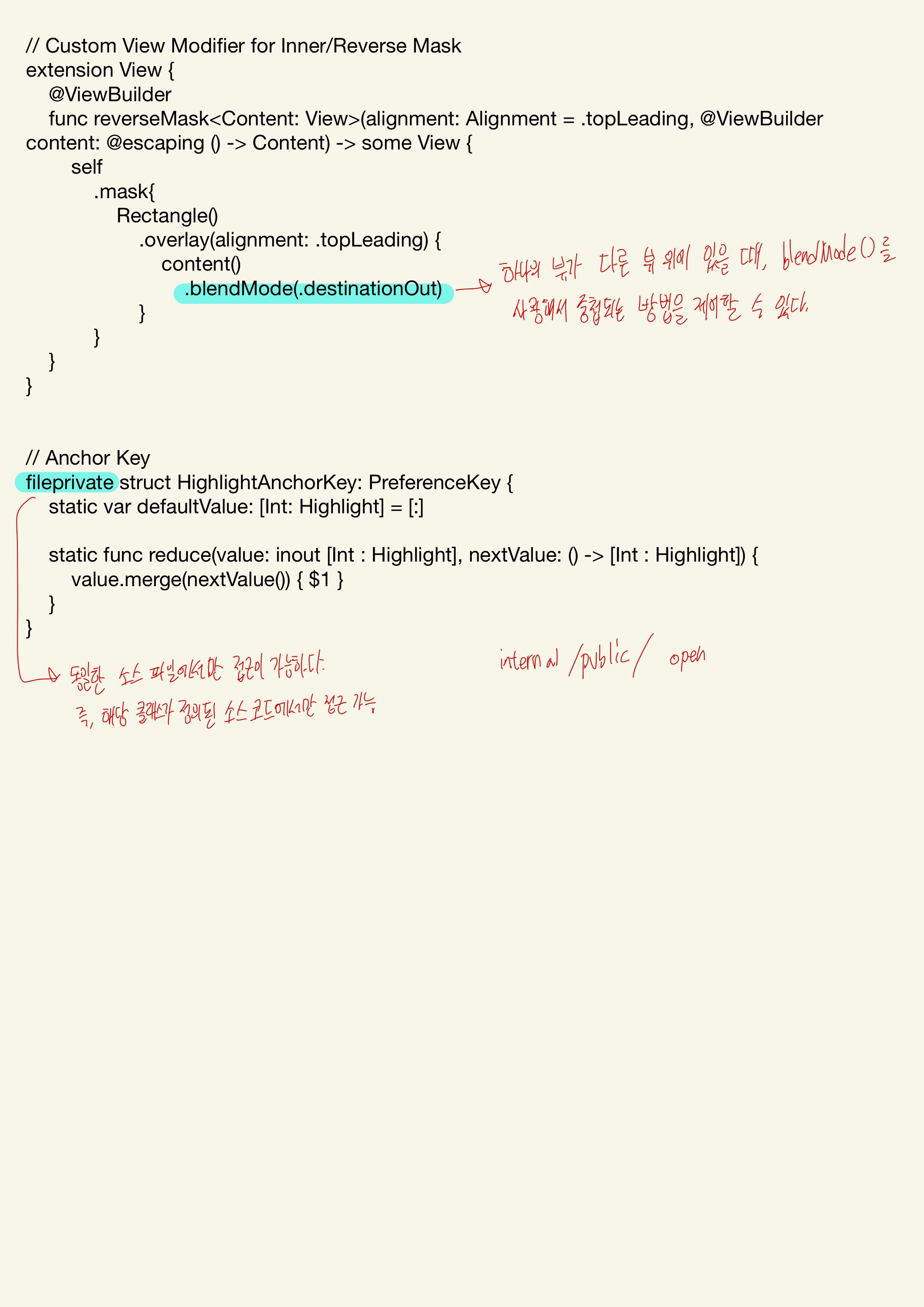
// Custom View Modifier for Inner/Reverse Mask
extension View {
@ViewBuilder
func reverseMask<Content: View>(alignment: Alignment = .topLeading, @ViewBuilder content: @escaping () -> Content) -> some View {
self
.mask{
Rectangle()
.overlay(alignment: .topLeading) {
content()
.blendMode(.destinationOut)
}
}
}
}
// Anchor Key
fileprivate struct HighlightAnchorKey: PreferenceKey {
static var defaultValue: [Int: Highlight] = [:]
static func reduce(value: inout [Int : Highlight], nextValue: () -> [Int : Highlight]) {
value.merge(nextValue()) { $1 }
}
}
struct ShowCaseHelper_Previews: PreviewProvider {
static var previews: some View {
ContentView()
}
}
ViewBuilder Attribute
정의: Closure에서 View를 구성하는 custom parameter attribute이다. -> 클로져에서 View(Child)를 구성한다.
함수형 빌더이며 ViewBuilder를 사용하면 함수의 반환 값으로 여러 개의 View를 반환하는 것이 가능해진다. View 계층 구조를 쉽게 작성할 수 있다.
주로 반복문, 제어문에서 View를 반환할 때 유용하게 사용된다.
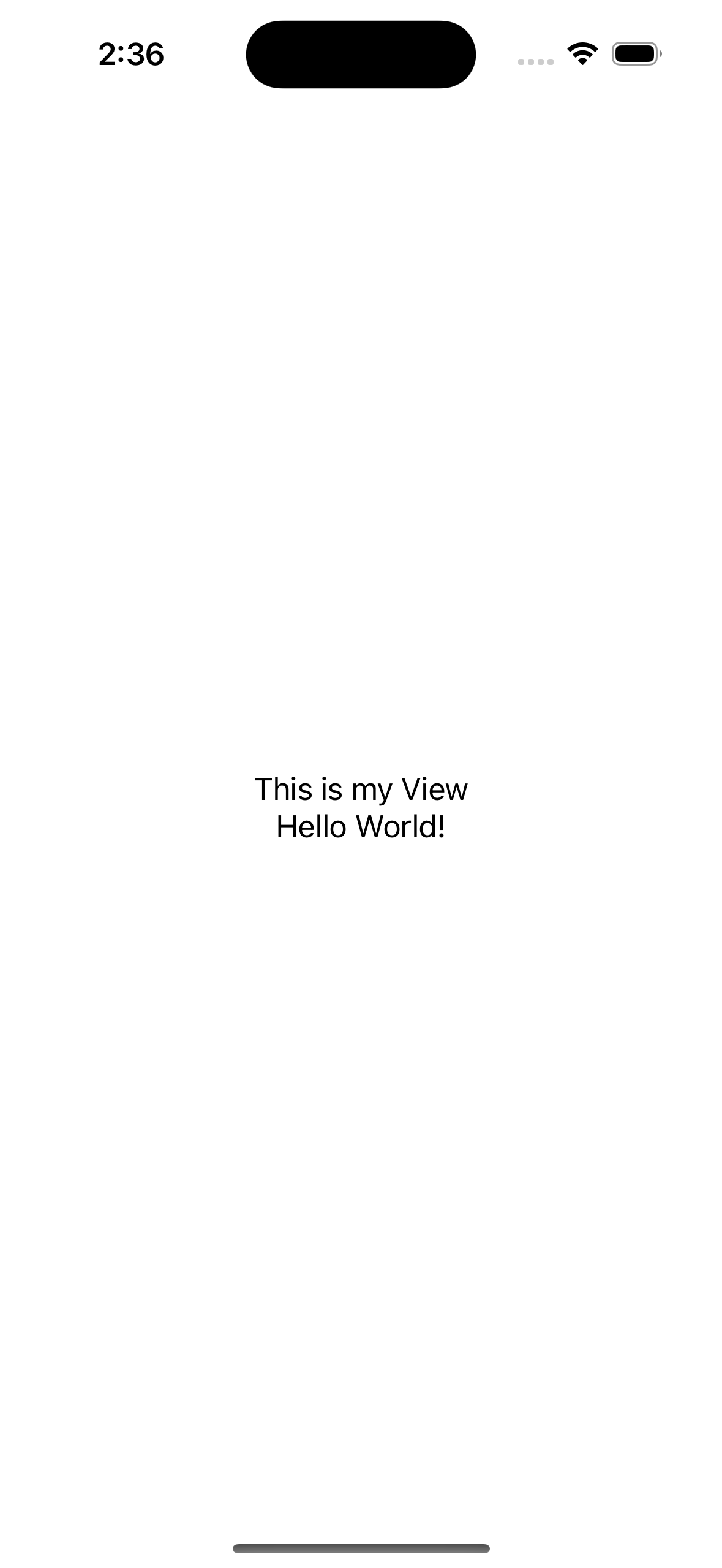
func myView<Content: View>(@ViewBuilder content: () -> Content) -> some View {
    VStack {
        Text("This is my View")
        content()
    }
}

struct ContentView: View {
    var body: some View {
        myView {
            Text("Hello World!")
        }
    }
}
학습하며 느낀점 🧑🏻🏫:
구글링을 통해 학습하면 Apple이 제공하는 Document보다는 전문가(나보다 훨씬 고수님들)분들이 작성하신 블로그를 우선적으로 클릭하게 된다. 한글로 읽는 것이 편하고 편하고.. 또 편하니까. 그러다 산을 만나게 되었는데 .popover Modifier의 .presentationCompactAdaptiation Modifier는 iOS 16.4 (작성 기준 현 iOS 16.6) 업데이트 때 ㄷㄷㄷㅈ한 놈이다.
당연히 누군가 적어주었겠지 했지만... 아직 고수님들이 안계신듯.. 하여 document를 보며 고심하고 영어 블로그로 가게 되었다...
역시 한글사랑 나라사랑. 광복절 대한민국 만세. (그래도 document를 참고 버릇 하....자..?)