Apple Developer Documentation
developer.apple.com
공식 링크
Text and symbols
When defining the layout for your app, text and symbols play a central role in conveying information to people - in navigation links, button labels, and more. Text and symbols that information or label other elements need to have enough space to display their contents.
Text
A Text view displays read-only text. Its contents could be a short String, like the title of a play or the heading of a section. A Text view could also display a much longer String, like all of the actors' lines for a scene in the play
When you declare a Text view in your layout, give the system semantic information about your text with the Font attribute. The system chooses font faces and sizes so that, for example, a Text with the title font is more prominent thatn one with body or caption.
Text("Halmet")
	.font(.largeTitle)
Text("by William Shakespears")
	.font(.caption)
    .italic()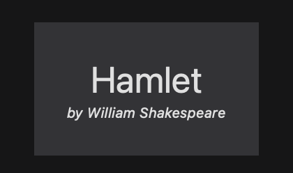
A Text view can adjust to some space constraints with line-wrapping or truncation, but it doesn't change font size to accommodate situations where its ideal size is smaller or larger than the available space.
Symbols
Symbols, such as the iconography that SF Symbols provides, can denote common app features, like folders, heart shapes for favorites, or a camera icon to access the camera. Effective symbols streamline your app's UI, and are easily recognizable by the people who use your app. You can customize their colors and sizes using standard view modifiers provided in SwiftUI. Even though you specify a system or custom symbol in an Image, treat SF Symbols more like text.
To adjust the size and weight of a symbol, specify a semantic Font, like title, just like you would for a Text view.
HStack {
	Image(SystemName: "folder.badge.plus")
	Image(SystemName: "heart.circle.fill")
	Image(SystemName: "alarm")
}
.symbolRenderingMode(.multicolor)
.font(.largeTitle)
Labels
To use both text and a symbol to represent a single element in your app, use a Label. A Label takes care of matching its title and icon sizes and their alignment. The floowing code defines a Label that combines an SF Symbol of some books, with some text for its title. The Label applies the largeTitle font to both the icon and the title. The titleAndIcon style tells the view to display both its title and icon, overriding any built-in or custom LabelStyle that a containing view might specify.
Label("Favorite Books", systemImage: "books.vertical")
	.labelStyle(.titleAndIcon)
    .font(.largeTitle)
'IOS' 카테고리의 다른 글
| Playground 코딩 배우기2 - 스위치 모으기 (0) | 2023.05.15 |
|---|---|
| SwiftUI-100Days - WeSplit (0) | 2023.04.07 |
| iOS Beginner Challenge Lesson4 by CodewithChris (0) | 2023.01.16 |
| Swift - 클로저 {} by yagom (0) | 2023.01.11 |
| IOS, Swift, Xcode - Basic App - ToDoList 단계별 뽀개기[2] -UIViewController (0) | 2023.01.11 |


